/ Knowledge base /
How to create a pop-up form?How to create a pop-up form?
Every visitor to your website is a potential customer. But how can you connect and keep them engaged? The answer: pop-up forms.
With their vivid colors and dynamic animations, these eye-catching tools are your gateway to building a robust email list and fostering lasting relationships.
Here's how to set one up with theMarketer:
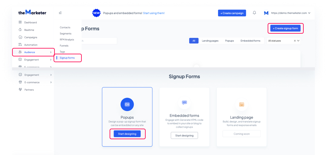
1. Go to ‘Audience > 'Signup forms', click 'Create signup form', and select ‘Popups’.
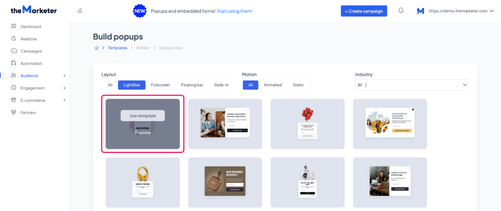
2. Select a template.
You’ve now reached the pop-up template gallery. Using the tabs and the drop-down menu, you can filter the templates displayed based on their layout, whether they are static or animated, as well as the industry their design matches.
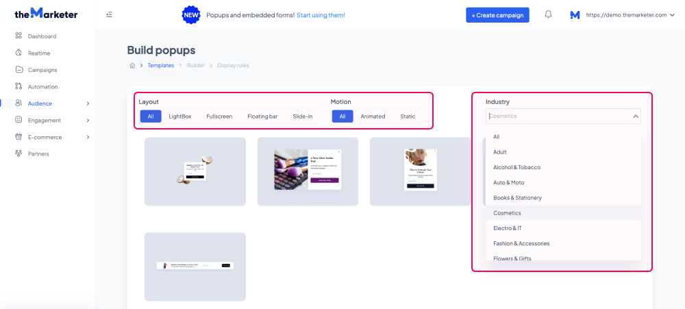
Hover your cursor over a template and select ‘Preview’ to see a magnified version of it (click anywhere on the screen for it to disappear) or select ‘Use template’ to proceed with editing the template.
3. Customize the template.
On the left-hand side of the editor, you can preview how your pop-up will look on desktop and mobile devices by clicking the corresponding icons at the top. If you’d like to limit the visibility of your pop-up to certain types of devices, you can click the three vertical dots next to the preview icons and disable either option by clicking the toggle button (turning it grey).
The 'Templates' button allows you to return to the gallery and change the template you are currently editing.
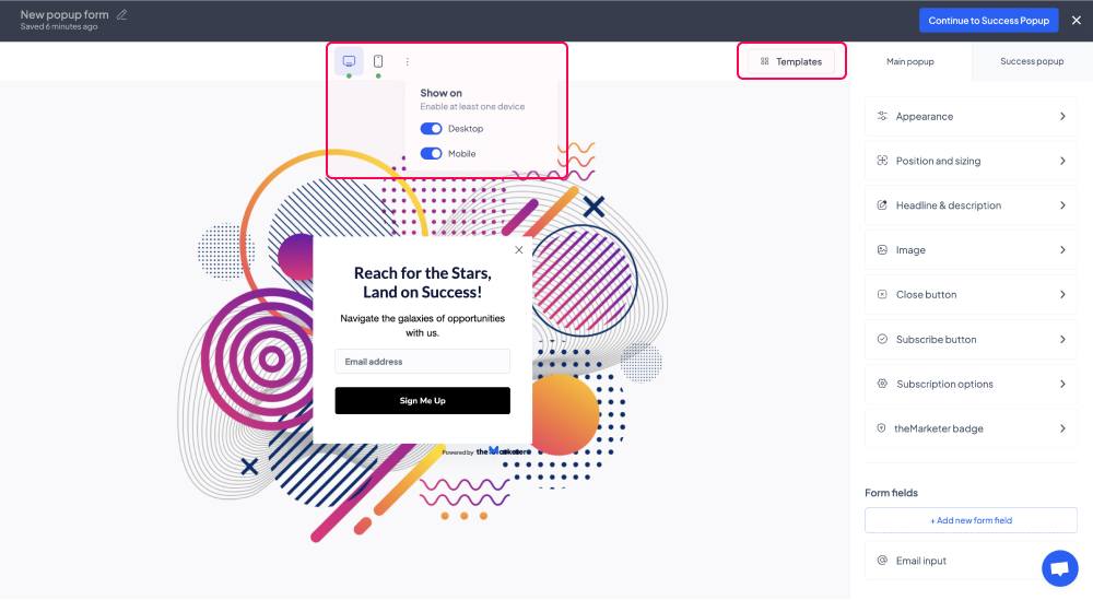
On the right-hand side of the editor, you will see the tabs and the options which you can use to customize the pop-up.
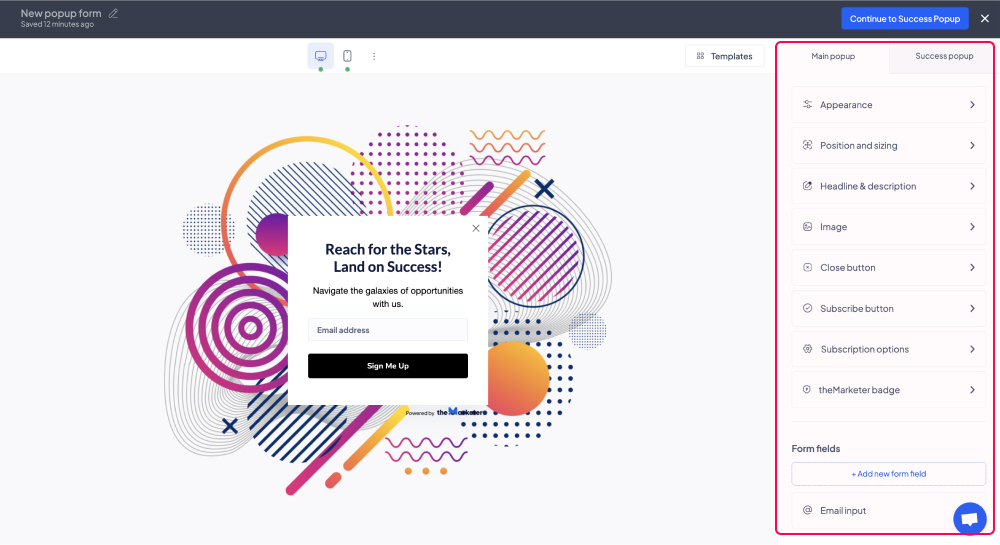
By clicking the 'Appearance' menu item under ‘Main popup’, you can edit the design of your pop-up, including the body background color, the popup radius (i.e. how rounded you’d like the corners of your pop-up to be), and the entry effect.
You can also click the ‘Enable overlay’ toggle button (turn it blue) to enable an overlay and make the pop-up stand out even more. Once enabled, you can customize the overlay and add animated effects.
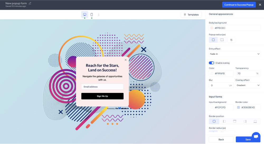
In the ‘Input forms’ section, you can customize the appearance of the field(s) where users will type their personal information.
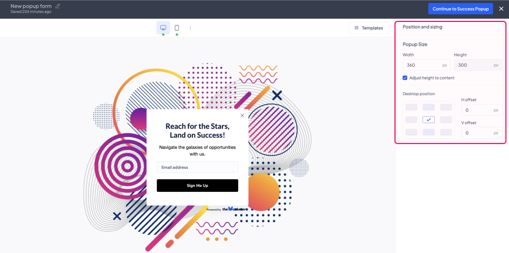
When clicking the ‘Position and sizing’ menu item you will be able to adjust the width, height, and position of your pop-up. Please note that depending on the layout you’ve selected (e.g. LightBox, Slide-in, etc.), your options may be limited. For example, a Slide-in template cannot appear in the center of a desktop screen, meaning you would have to select a LightBox template instead.
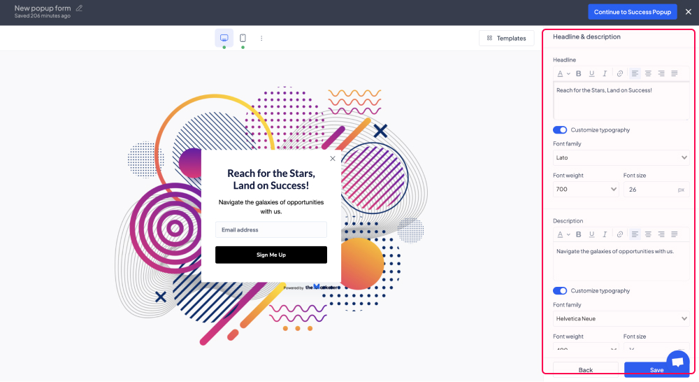
By clicking the ‘Headline & description’ option you will be able to customize the texts displayed on your pop-up including their color, alignment, font, size, etc.
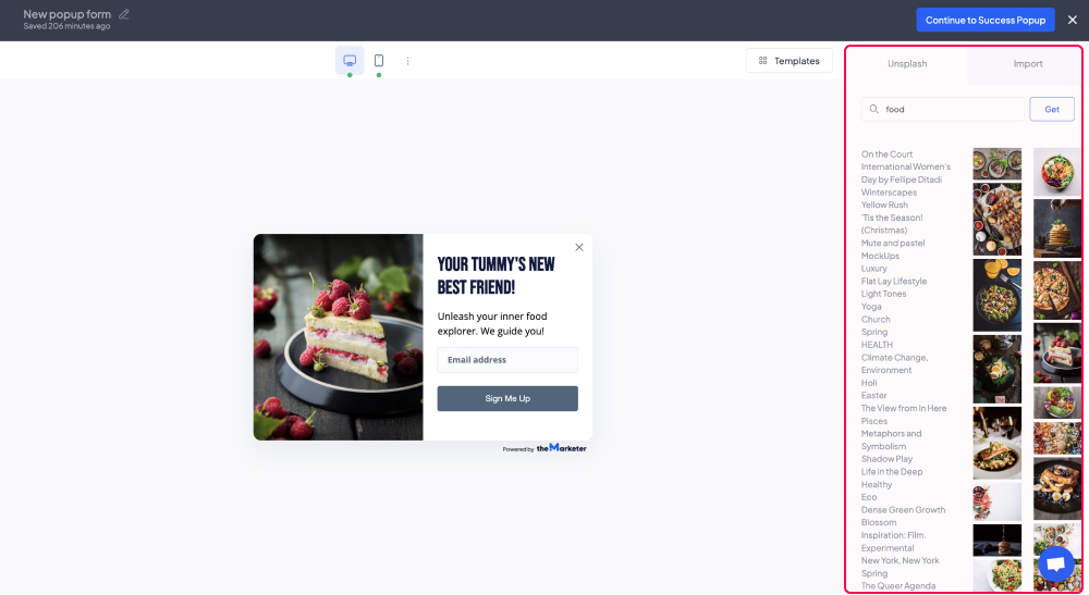
The ‘Image’ menu item allows you to customize the picture included in your pop-up. You can click the button on the top right to hide or show the image. To replace the image with a different one, click the ‘Change image’ button then either browse the Unsplash collection of pictures or upload one from your computer. You can also rotate and flip your images, and even pick different ones for the pop-ups displayed on mobile devices.
In the ‘Close button’ section you can adjust the appearance of the button which allows users to close your pop-up. If you’d like to make it easy for your website visitors to close the pop-up you can enable the ‘Click overlay to close’ option.
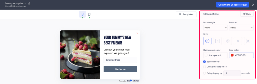
Similarly, if you’d like to make sure they will spend at least a few seconds reading the content of your pop-up instead of instinctively closing it, you can set a set number of seconds after which the closing button will appear.
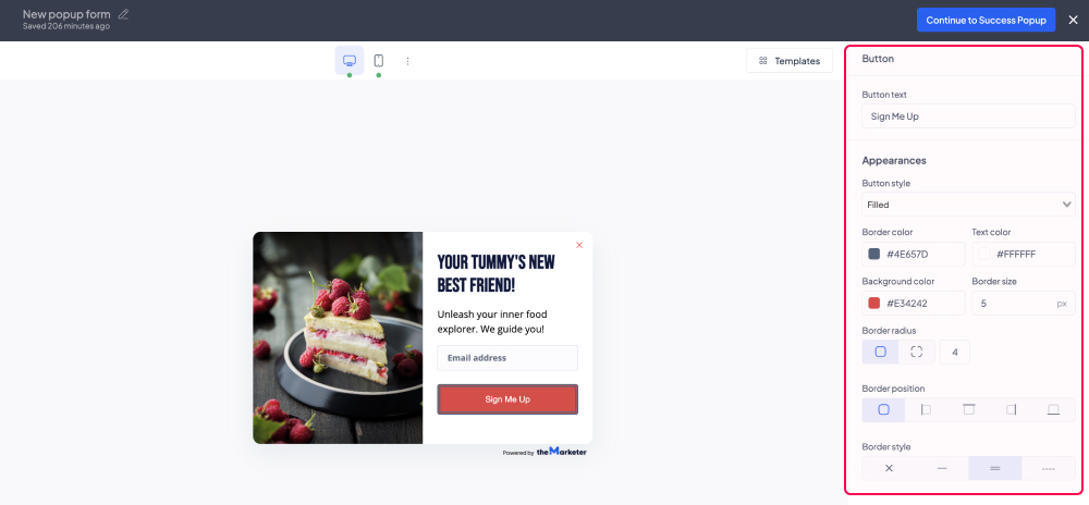
By clicking the ‘Subscribe button’ option you will be able to adjust the appearance of the call-to-action button, as well as the text displayed on it.
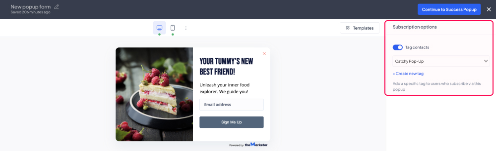
If you would like to tag the users that join your contact list through the pop-up you’re currently building, in the ‘Subscription options’ section you can click the ‘Tag contacts’ toggle button (turn it blue) and select from the drop-down list one of the existing tags.
To create a new custom tag, click ‘Create new tag’, type its name in the dialog box, then go back to the drop-down list and select the newly created tag.
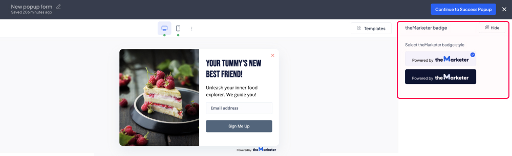
By clicking ‘theMarketer badge’ option, you will be able to change the appearance of theMarketer badge, so that it matches either light or dark themes. Depending on your current plan, you can also choose to hide or show the badge, by clicking the button on the top-right corner.
In the ‘Form fields’ section, you can edit the input fields featured on your pop-up. To add a new field, click ‘Add new form field’, then select the type of element you would like to include. Please note that if you choose to add more than three input fields, your pop-up might end up looking distorted on mobile devices.
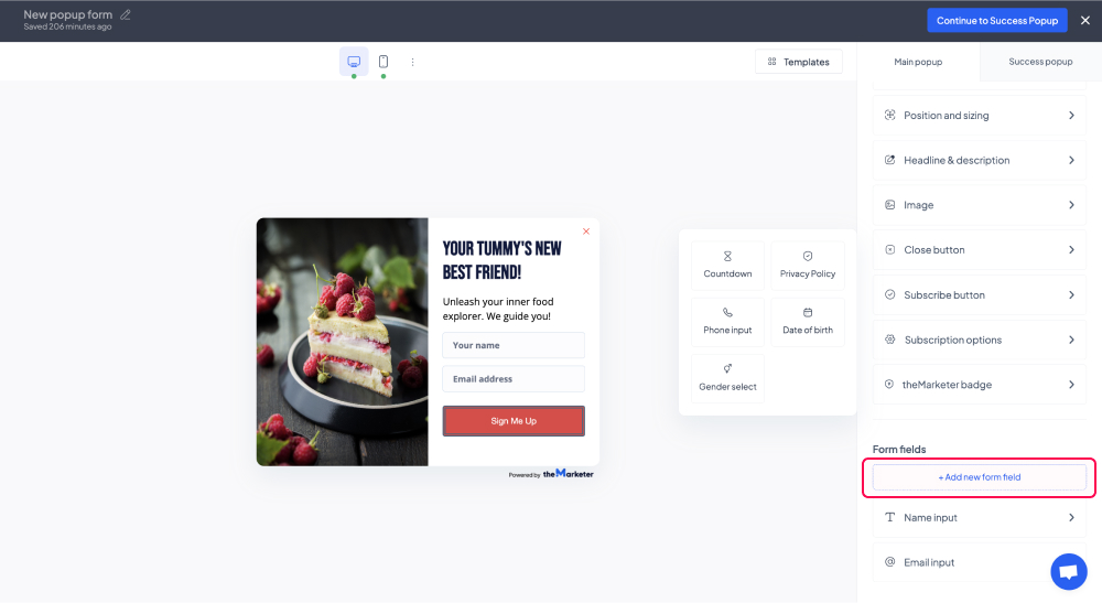
You can change the order of the fields on your pop-up by dragging and dropping them in the right order in the ‘Form fields’ section.
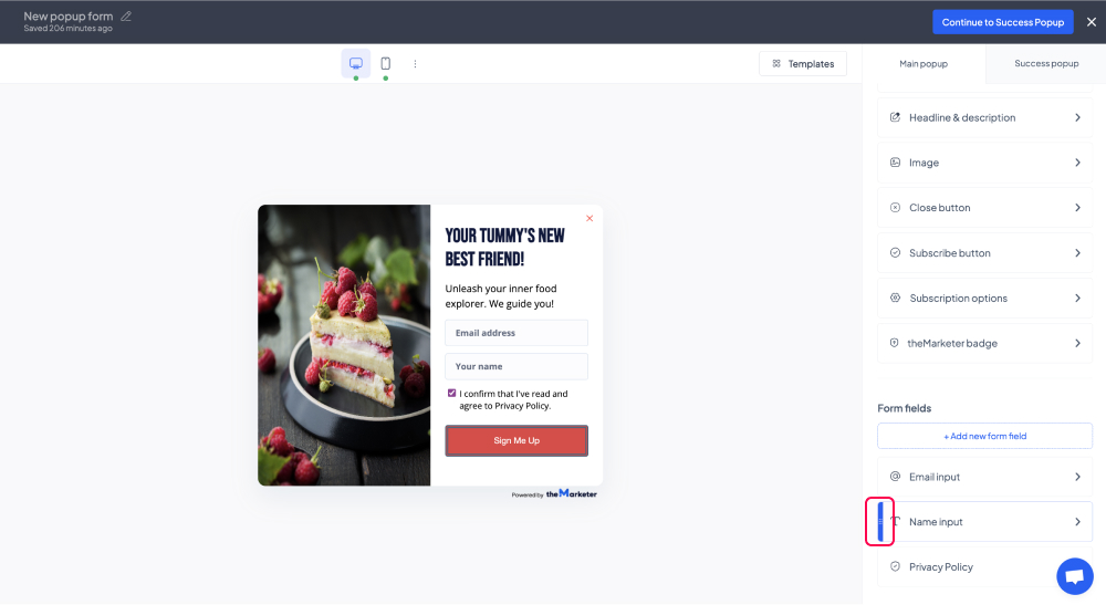
To edit the particularities of a field or remove it from your pop-up, simply click on its name under the ‘Form fields’ section and additional customization options will appear, including the ‘Hide’ button on the top-right corner of the screen.

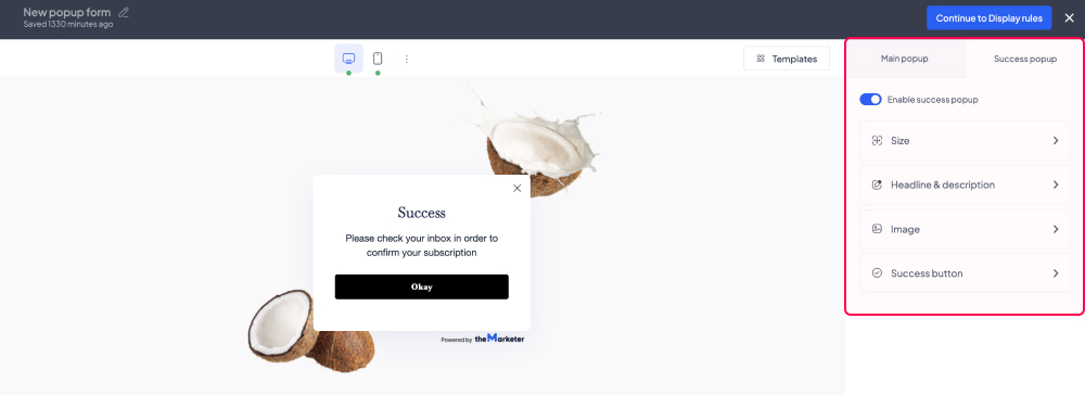
Under the ‘Success popup’ tab you will be able to preview and edit the pop-up displayed once users submit their information using the main pop-up.
The success pop-up can also be disabled by clicking the ‘Enable success popup’ toggle button and turning it grey, but it is generally a familiar and clear way of letting users know their action was successful and communicating further instructions, such as the need to confirm their subscription as part of double opt-in.
4. Set the display rules.
You can determine which action will cause your pop-up to appear:
- Page landing - the moment a visitor loads a page of your website.
- Exit intent - when a visitor appears to want to leave your website.
- Scroll depth - the moment a visitor scrolls down a certain number of pixels on the page.
- Click count - as soon as the visitor has clicked a certain number of times on the page.
- Inactivity - when a visitor has passed a certain period of time being idle.
Using the advanced options, you can also limit the frequency of your pop-up, its audience, the website pages on which it will be displayed, as well as the period during which it will be active.
Additionally, for ‘Page landing’, you can delay the moment the form appears by clicking the ‘Time delay’ toggle button (turning it blue) and typing the desired number of seconds in the corresponding field.
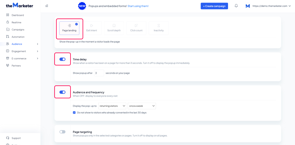
For example, if you would like your pop-up to be displayed only to the users that have already visited your website, 3 seconds after they’ve accessed it, you should enable ‘Time delay’ and set it to 3 seconds. Once you’ve done this, enable ‘Audience and frequency’ and select ‘returning visitors’ in the first drop-down list. You can also select the ‘once a week’ option in the second drop-down list to avoid disturbing your returning visitors.
And… you’re done!
You now have an eye-catching pop-up that will help you grow your contact list in the most effective way.
Related articles
STILL HAVE QUESTIONS?