/ Knowledge base /
How to create and edit landing pagesHow to create and edit landing pages
Landing pages are the driving force behind lead generation, subscriber growth, and one-click conversions. Whether you're collecting email addresses, promoting a seasonal campaign, or offering a thank-you message following a review submission, a well-built landing page can make all the difference.
This feature is a little more advanced than the user-friendly tools you’ve grown familiar with so far. That’s because it uses a flexible, component-based builder, which opens up a world of customization, especially if you have some CSS experience.
But don’t worry: with the right instructions and a few practical examples we’ll cover in this article, you’ll find that building your own landing page can be just as intuitive and rewarding.
⚠️ Before you begin: To use the Landing Pages module, your domain must be validated. If you haven’t done this yet, head to 'Settings' > Email setup' and complete the process.
Let’s walk through each step so you can confidently create your first landing page from scratch or fine-tune an existing one.
1. In theMarketer app, head to ‘Audience’ > ‘Landing pages’
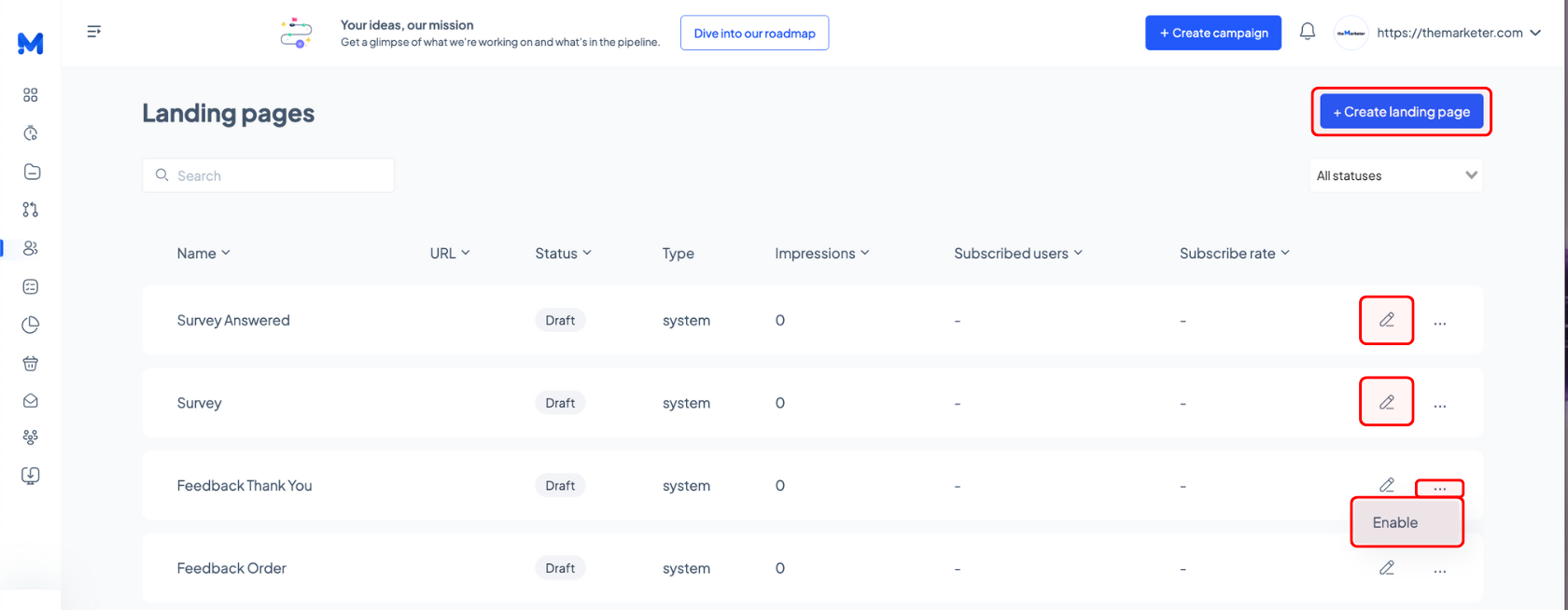
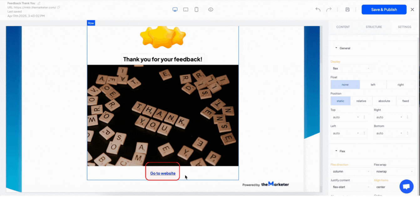
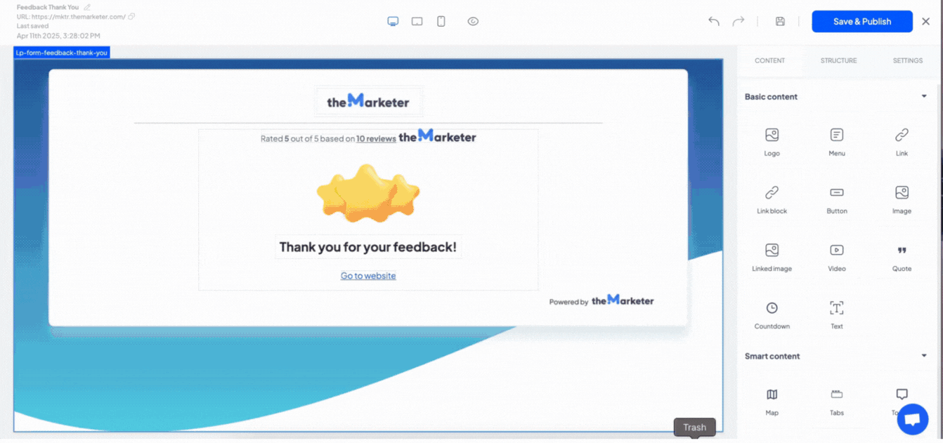
Here, you'll see a list of default, ready-to-use pages, such as Feedback Thank You, Survey, or Unsubscribe. These are marked as "system" under the Type column.
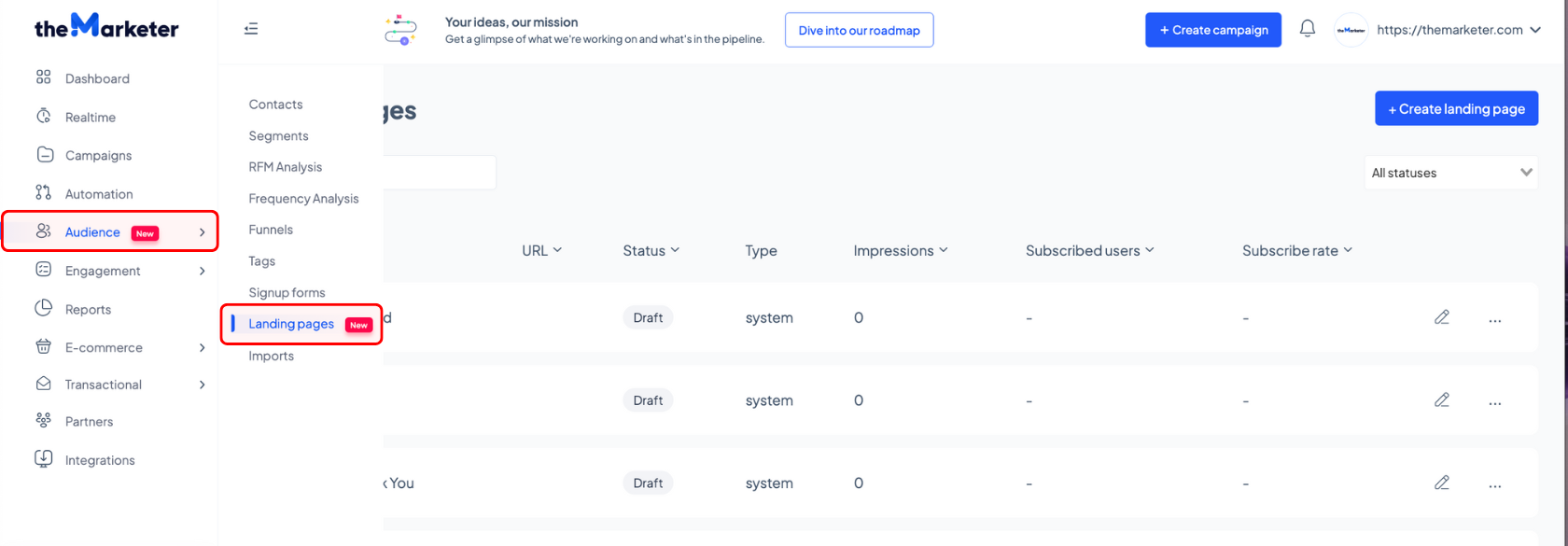
To edit the content of a system page, click the corresponding pen icon or click the three dots on the right to enable and publish it.
To create a custom landing page, click the ‘+Create landing page’ button on the right.
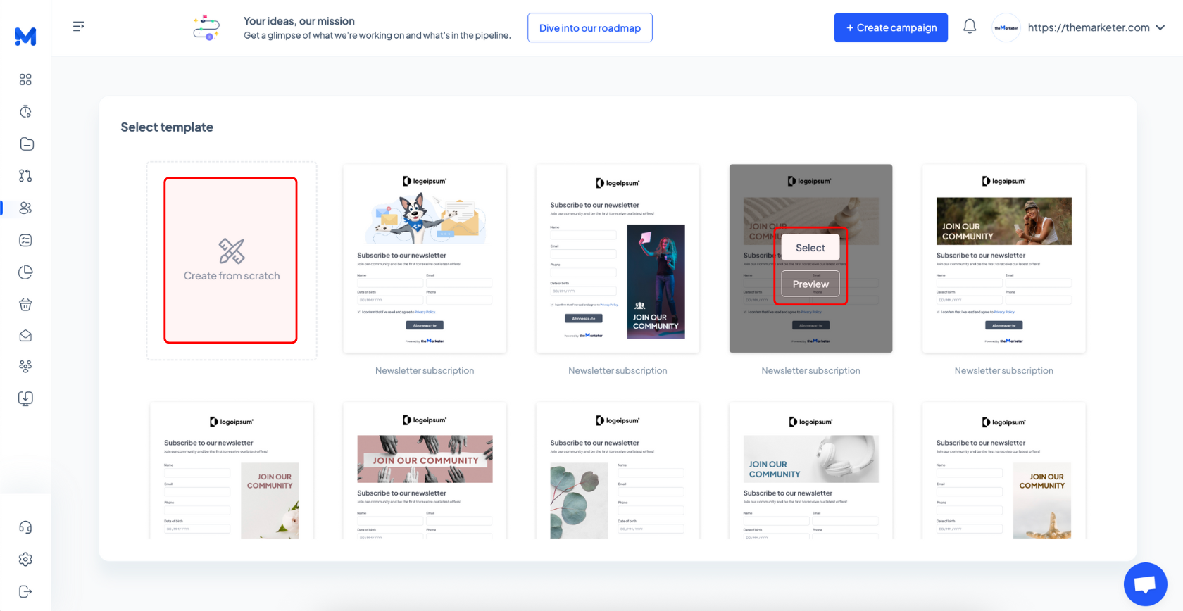
2. Select a template or start from scratch
This step works much like creating a newsletter; you can browse available templates and preview them in full before making a decision.
Once you find one that fits your needs and goals, click 'Select' to begin customizing it.
If you’re experienced with landing page builders or have some CSS knowledge, feel free to skip the templates and start from scratch.
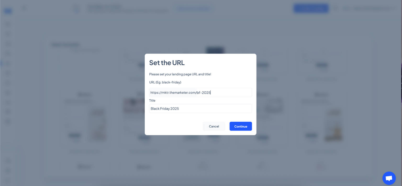
3. Set the URL and title of your landing page
Be careful when typing the URL of your landing page, because once it's set, it cannot be changed. You can edit the title of your page at any time in the editor, but the URL is permanent, so make sure you get it right before proceeding to the next step.
Keep it short, relevant, and clear, and use lowercase letters, numbers, and dashes (instead of spaces).
4. Edit the content and design of your landing page
At first glance, the landing page editor may look similar to the email editor, but it comes with extra flexibility and more advanced design settings.
At the top left of the screen, you'll see the page title, which you can rename by clicking the pen icon, the URL, which you can copy by clicking the corresponding icon, and the last saved timestamp, which shows when your page was last updated.
In the middle of the top bar, you'll find three preview icons that let you toggle between desktop, tablet, and mobile views, so you can check how your page will look across devices. Click the eye-shaped icon to preview the landing page without the visual guidelines of components or layout markers.
Further to the left, you’ll see the undo, redo, and save icons, along with the ‘Save & Publish’ button and the exit button for closing the editor.
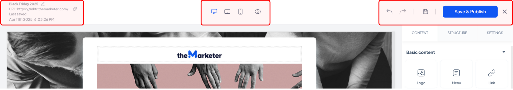
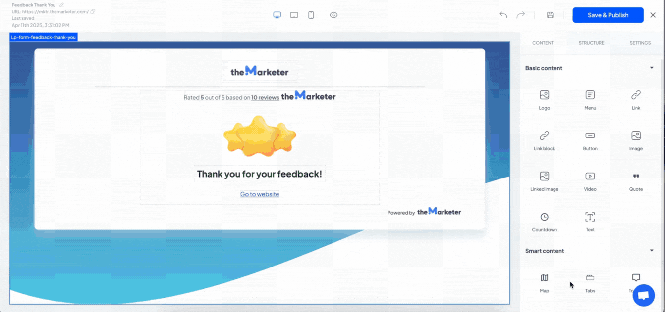
Just like in the email builder, the left side of your screen shows the canvas preview, and the right-hand side features three important tabs: Content, Structure, and Settings.
a. Content
Most of the blocks here mirror those in the email editor, but there are a few key differences and specialized components designed for landing pages.
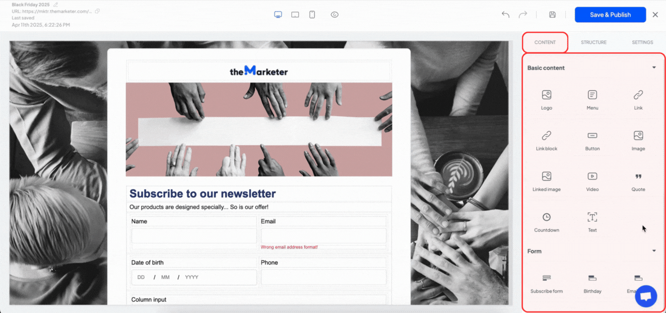
- Link – Adds a basic text block that includes a hyperlink.
- Link Block – Unlike the email editor, links aren’t applied directly to elements, but to their parent containers. This block lets you place any content (like a button or image) inside a cell that acts as a clickable link.
- Image – Adds a standalone image.
- Linked Image – Adds an image wrapped in a link block, allowing you to redirect users to a specific URL when they click it.
- Quote – A variation of the text block, visually styled to highlight testimonials or statements.
- Form Fields – Similar to pop-ups, these allow you to drag and drop form fields (like name, email, phone) for lead generation or subscriptions.
- Map – Adds a customizable Google Maps widget. You can adjust the address and visual style once placed.
- Tabs – Introduces tabs with switchable content areas (just like the Content, Structure, and Settings tabs you’re currently exploring). You can drop different blocks inside each tab to display varied information.
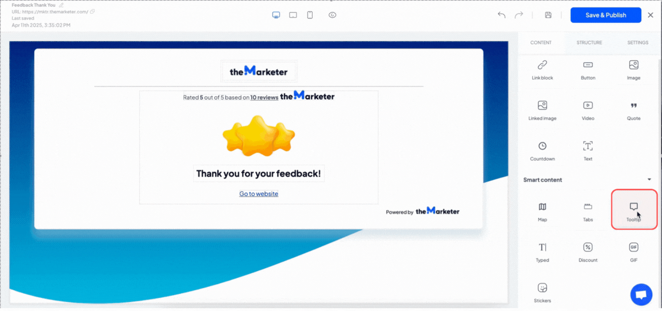
- Tooltip – Enables interactive hover-over messages. Drag and drop the tooltip element, customize the text on the right, and then place the content users should hover over inside it.
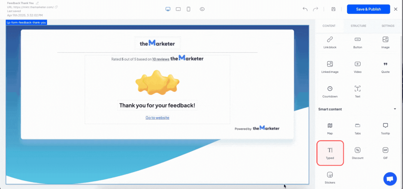
- Typed – Adds animated text effects (think typewriter effect). You can customize the speed, phrases, and styling from the settings tab.
b. Structure
This section works similarly to the email editor; simply drag and drop layout components into the canvas, then place your content blocks inside the cells. This keeps your layout clean and ensures your page displays properly across devices.
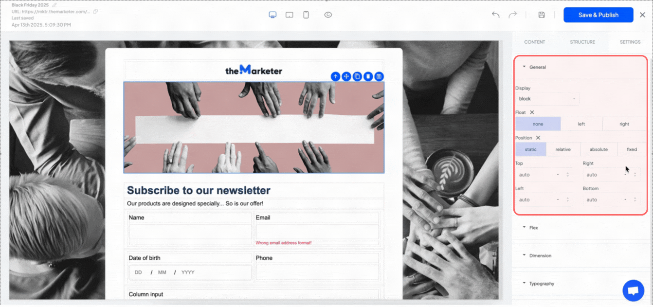
c. Settings
The Settings tab gives you extra control over how elements appear and behave on your landing page. If you’re not familiar with web design terminology, don’t worry; we’ll break it down with simple explanations and practical examples.
General > Display – This setting defines how an element appears in relation to others:
- Block: Takes up the full width of the container. Great for headlines or banners.
- Inline: Keeps elements in line with others (like a hyperlink inside a sentence).
- Inline-block: Keeps elements in line with others, while giving you the ability to set width and height.
- Flex: Enables advanced alignment and layout control (see Flex settings below).
- None: Hides the element. Useful if you want to keep an element in the editor but not show it on the page.
General > Float – This setting allows you to move an element to the left or right side of its container. It is mostly used for images or small icons:
- None: Default, no floating.
- Left: Text or content will wrap around it on the right.
- Right: Text or content will wrap around it on the left.
General > Position – Helps you place elements exactly where you want them:
- Static: The default position, with no special placement.
- Relative: Lets you nudge the element from its normal spot.
- Absolute: Positions the element relative to its nearest container.
- Fixed: Keeps the element in place while the user scrolls. Ideal for sticky headers or buttons.
For any position other than static, you'll also see fields labeled Top, Right, Left, and Bottom. These let you fine-tune exactly where your element should appear. For example, if you select relative and type 20px in the Top field, your element will shift 20 pixels downward from its original spot.
Flex settings will only apply when Display is set to flex.
Flex direction – Controls the direction of elements inside a container. It is useful when you want to stack elements vertically or reverse their order:
- Row: Items line up from left to right (default).
- Row-reverse: Items line up from right to left.
- Column: Items line up top to bottom.
- Column-reverse: Items line up from bottom to top.
Flex wrap – Tells elements whether to stay in one line or wrap onto the next:
- Nowrap: Keeps everything on a single row.
- Wrap: Moves items to the next line when space runs out (ideal for grids).
- Wrap-reverse: Wraps items in reverse order.
Justify content – Aligns items horizontally:
- Flex-start: Aligns everything to the left.
- Flex-end: Pushes everything to the right.
- Center: Centers the content.
- Space-between: Spaces items evenly, no gap at edges.
- Space-around: Spaces items with even gaps all around.
- Space-evenly: Sets equal spacing between all items.
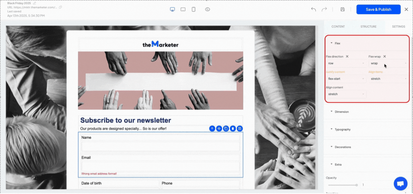
Align items – Aligns content vertically within a single row:
- Flex-start: Aligns to the top.
- Flex-end: Aligns to the bottom.
- Center: Vertical centering.
- Baseline: Aligns text with the base of nearby text.
- Stretch: Fills vertical space.
Align content - Similar to Align items, but works across multiple rows. It is best used when items wrap and you want to control vertical spacing between rows.
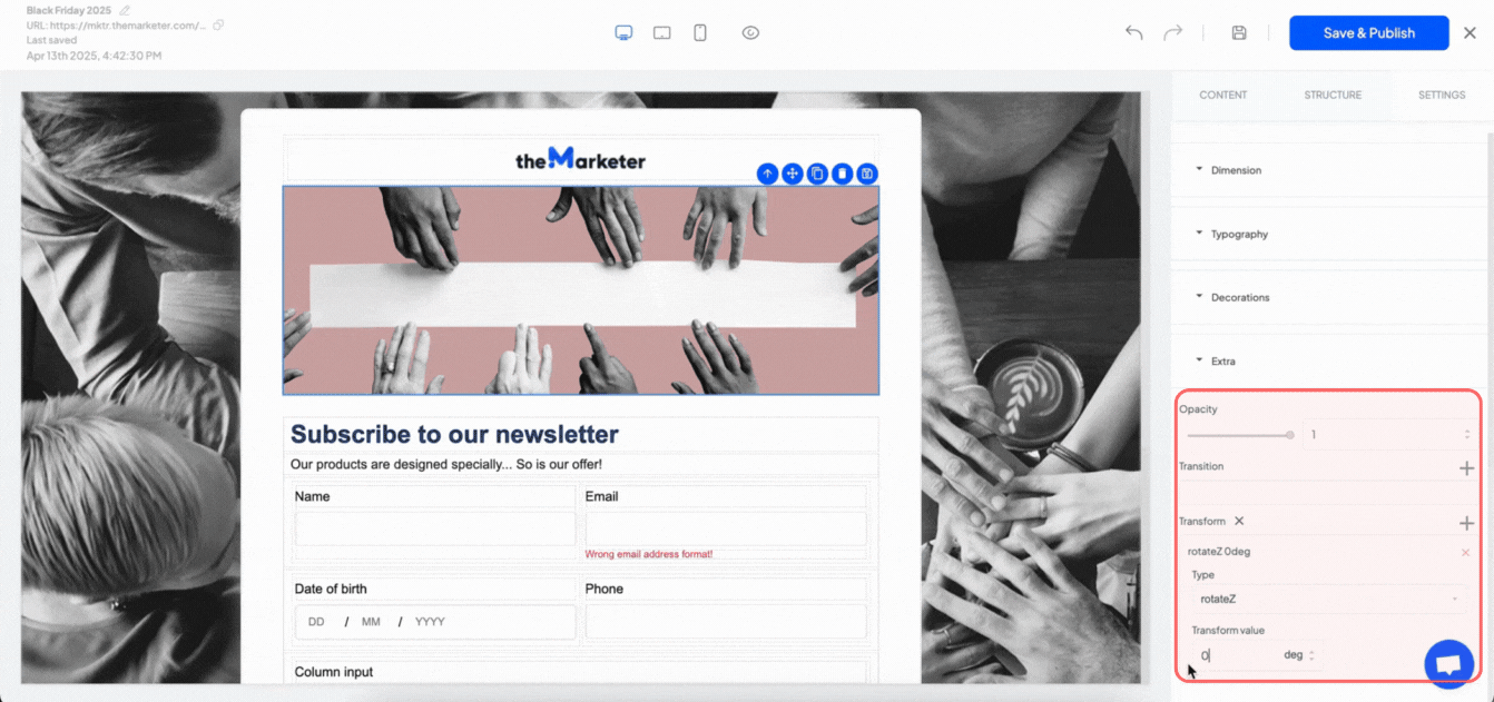
Extra - These additional settings allow you to add visual effects or styling enhancements to elements on your page. They can help you draw attention to key areas or create a more dynamic experience.
You can control transparency in the ‘Opacity’ section. Set it to 1 for full visibility, or lower for a faded look. Additionally, using the ‘Transform’ setting, you can rotate, scale, or move elements.
5. Save and publish your landing page
Once your landing page is ready, click the ‘Save & Publish’ button at the top of the editor.
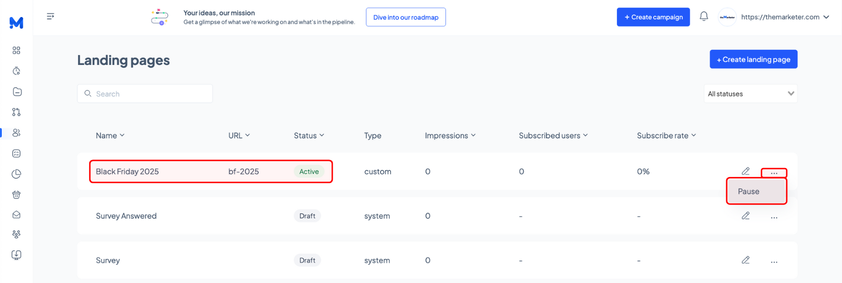
You’ll be taken back to the Landing Page listing, where you’ll see the title, URL, and publication status of your page. To make changes later, simply click the pen icon to reopen the editor. If you need to take a page down, click the three-dots and select ‘Pause’. Once you do this, it will no longer be accessible via its URL
And… you’re done!
We know this was a more technical module, but now that you’ve reached the end, you should feel confident navigating the editor and building landing pages that help you stand out, engage more effectively, and convert effortlessly.
Related articles
STILL HAVE QUESTIONS?