/ Knowledge base /
How to set up the launcher?How to set up the launcher?
theMarketer's on-site Launcher is a tool designed to enhance engagement and guide customers in real time.
It acts as a control center where your visitors can sign up for newsletters, join loyalty programs, see their loyalty point balance, discover the rewards they've unlocked, learn how they can earn more points, leave valuable reviews, and quickly refer your business to others.
Here’s how you can set up the launcher and transform your website into an engagement hub:
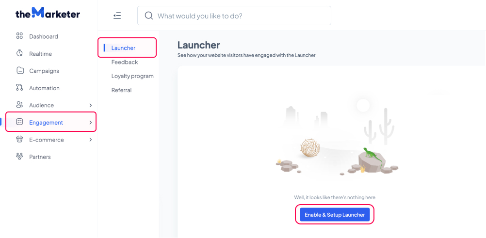
1. Go to 'Engagement' > 'Launcher' and click 'Enable & Setup Launcher'.
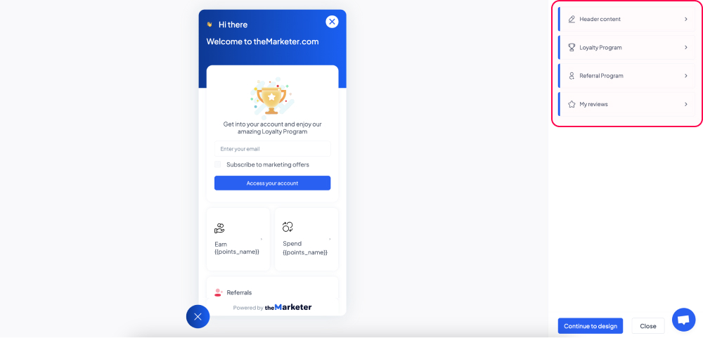
2. Adjust the content of your launcher.
You’ve now reached the launcher builder.
On the right-hand side, you will see all the sections you can edit in your launcher: the header content, the information linked to the loyalty program, the referral program, and the reviews section. To make changes to any specific section, click on it and the editor will display new editing options.
On the left-hand side, you can preview the edits you’re making and get a glimpse at what the final result will look like on your website.
a. Header content
The header is the topmost area of your launcher, where you can greet users and add a personalized message.
In the ‘Title’ field, you can edit the text that will be displayed alongside the logo (by default, you will see the ‘👋🏻’ emoji). Use something concise, such as a greeting message.
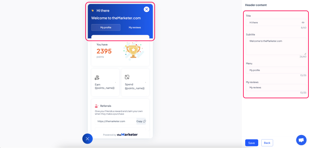
The content you type in the ‘Subtitle’ area will appear slightly larger than the title on your launcher. Here you can give users more contextual information. For example, you can welcome them to your website, and get them excited about being part of your community.
In the ‘Menu’ section, you can also edit the names of the two tabs ‘My profile’ - where users can see details about their evolution in your loyalty program and refer your business to other people -, and ‘My reviews’ - where users can leave their product or order reviews.
b. Loyalty program
Not all website visitors will automatically be part of your loyalty program. This is why the launcher will adapt the information displayed in the loyalty widget depending on their status.
Once you click the ‘Loyalty program’ section, you will see three options that determine the content to be displayed based on whether the user is part of your loyalty program or not.

By clicking the ‘Guest state’ option, you will be able to edit the information available to users who are not part of your loyalty program or haven’t signed in to their account yet.
You can change the text that appears below the illustration in the ‘Description’ field, the text helping users understand they are expected to insert their email address in the ‘Input placeholder’ field, and the consent message in the ‘Checkbox text’ field. Although all emails linked to the loyalty program are considered transactional and do not require explicit consent, you can use this option to get users’ permission to receive additional marketing materials, such as newsletters, for example.
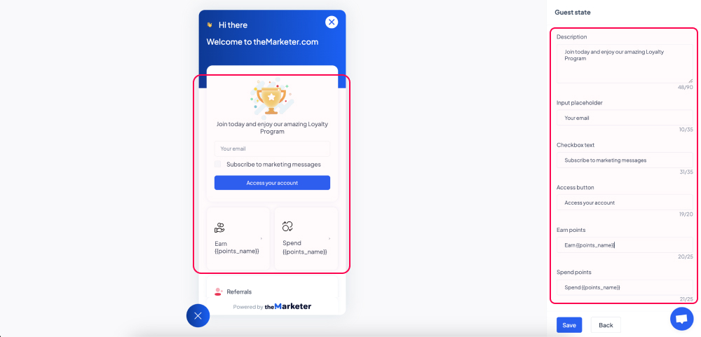
You can also modify the call-to-action in the ‘Access button’ field and the content introducing the point system in the ‘Earn points’ and ‘Benefits’ or ‘Spend points’ fields, depending on the loyalty model you have chosen.
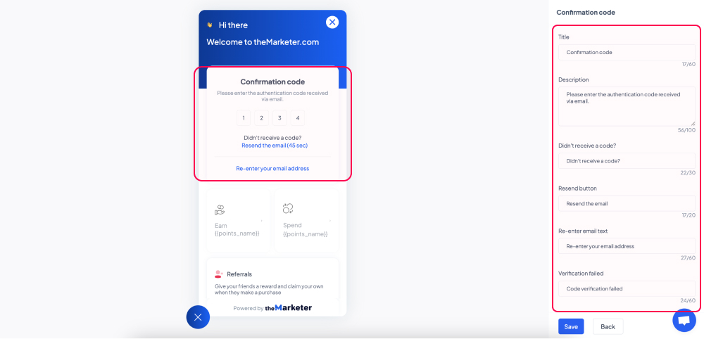
By clicking the ‘Confirmation code’ option, you will be able to edit the information displayed to the users who have submitted their email address and need to confirm it by inserting the code received at that address.
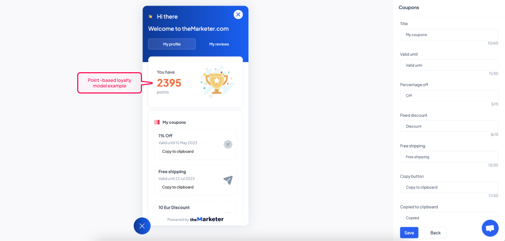
Lastly, by clicking the ‘Member state’ option, you will be able to adjust the information displayed to users who have signed in to their accounts.
Once again, depending on the loyalty model you have chosen and the types of rewards members can access, you will see various pieces of content which you can edit, from titles and descriptions to calls-to-action, expiration dates, and many more.
All these text edits come in handy especially if you need to manually translate the content displayed from English into another language.
c. Referral program
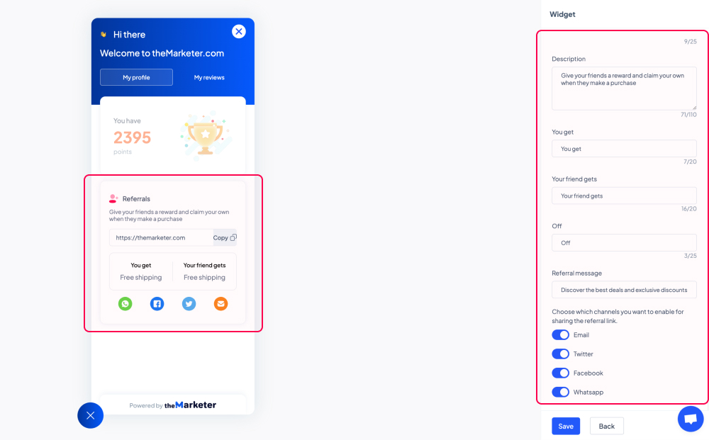
The ‘My profile’ tab also enables users to refer your business to their network, in exchange for the reward you set via the referral or loyalty program.
Besides being able to edit the content displayed in the referral widget, you can also click the toggle buttons to allow users to share their referral links with friends across various channels.
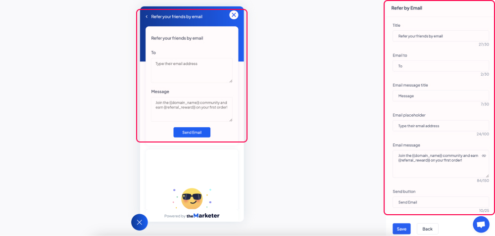
By clicking the ‘Refer by email’ option you will be able to edit the default message that users can send to their friends via email, as well as the confirmation message they will see as soon as their message is sent.
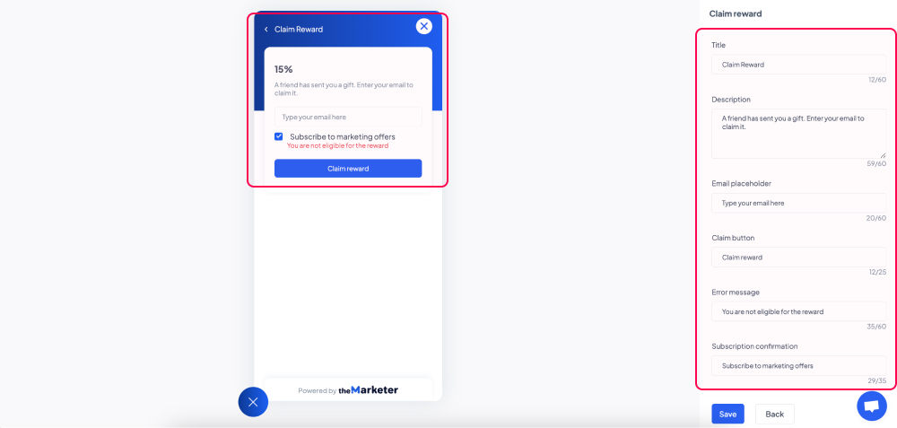
When you click the ‘Claim reward’ option you will be able to edit the version of the referral widget displayed to the people your clients have referred your business to.
Keep in mind that in order to claim their reward, those users need to insert their email addresses. Additionally, thanks to the ‘Checkbox text’ field - which you can set via the ‘Guest state’ view -, you can get users’ permission to receive additional marketing materials and as such, grow your contact base organically.
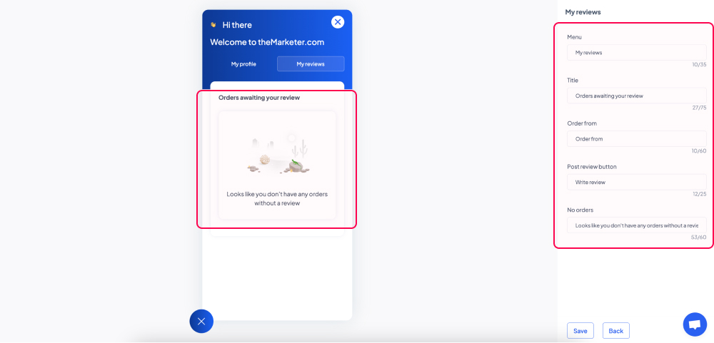
d. My reviews
The second tab of the launcher helps customers leave their product or order reviews in just a few clicks. Once you click ‘My reviews’, you can edit the content displayed in this section to match your branding, tone of voice, or the language of your website.
3. Edit the design of your launcher.
Once you’ve edited the content of your launcher, now it’s time to make the design match the aesthetic of your website. Click the ‘Continue to design’ button and you will see a new menu on the right-hand side of your screen.
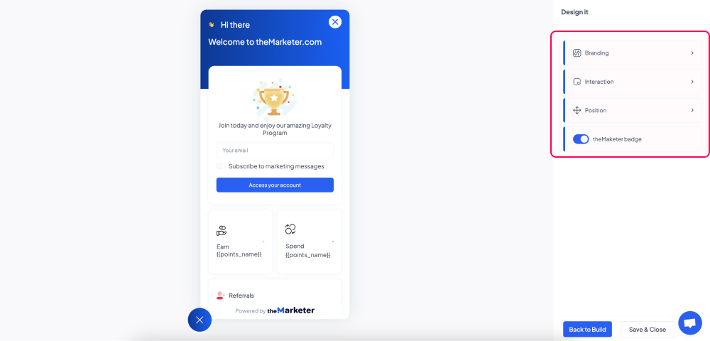
a. Branding
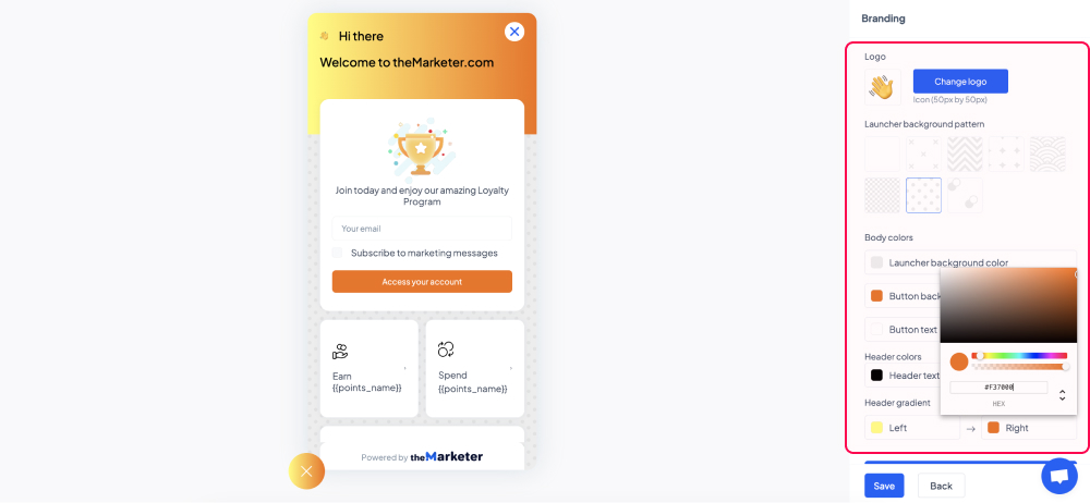
By clicking the ‘Branding’ option, you will reach the section that enables you to change the colors of the launcher and its graphic elements.
You can replace the default ‘👋🏻’ emoji with your logo or any other 50x50px image by clicking the ‘Change logo’ button. For optimal results, upload a .png with transparent background.
You can edit the background pattern by choosing among the 8 options available and you can pick custom colors for the background, button, texts, and header by using the color selection tool.
b. Interaction
In the ‘Interaction’ section you can decide how the launcher will behave on your website.
If you enable the ‘Auto-open widget’ toggle button (blue), then the launcher will automatically expand when users land on your website. If it’s disabled (grey), users will have to click on the icon to open it.
You can further refine the moment the launcher will automatically open by clicking the ‘Delay auto-open by’ toggle button. Once it’s enabled (blue), select from the dropdown options whether you’d like the system to keep track of the time users are spending on your website or the number of pages they’re browsing. Lastly, type in the field below the number of seconds or pages that needs to be recorded for the launcher to automatically open.
For example, if you’d like the launcher to open 7 seconds after a user landed on your website, regardless of how many pages they’ve browsed during this period, enable both toggle buttons, select ‘time’ in the dropdown menu, and type ‘7’ in the ‘seconds’ field.
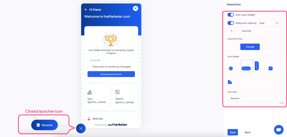
You can also upload a custom icon that will be displayed when the launcher is closed. Click the ‘Change’ button and select a 50x50px image, preferably a .png with transparent background.
To edit the shape and the label of the icon when the launcher is closed select one of the 5 options available and type the desired text in the ‘Icon text’ field.
c. Position
By clicking the ‘Position’ option, you can decide where on the screen the launcher should appear on both desktop and mobile.
Click the right or the left side of the screens illustrated to determine the alignment and then type the desired horizontal and vertical offset (the distance from the edge of the screen) by typing the number of pixels in the corresponding fields.
d. theMarketer badge
If you’re using one of theMarketer’s paid plans, you also have the option to hide theMarketer badge. You can do this by clicking ‘theMarketer badge’ toggle button and turning it off (grey).
And… you’re done!
You now have an eye-catching on-site launcher that will help you engage users in the most effective way.
Related articles
STILL HAVE QUESTIONS?