/ Knowledge base /
How to use email layout and structureHow to use email layout and structure
Understanding the structure of your emails is key to designing professional and responsive campaigns. theMarketer’s email editor provides a flexible framework that helps you arrange and display properly across different devices.
How email structure works
Whether you’re editing a template or starting from scratch, every email is built on a framework that optimizes content layout using invisible rows and columns.
This framework consists of:
- A parent container (the email ‘canvas’) – the base where all content is placed.
- Layout components – these ‘invisible containers’ are the structure that organizes your content.
- Content blocks – Text, images, buttons, products, and other elements placed inside layout components.
When you build an email, it’s like trying to arrange books (the email content) on a wall (the email canvas). Unless you have a bookshelf, the only way you can place the books is next to or on top of each other. But once you set up a bookshelf on the wall, you can arrange each book on the appropriate shelf, giving them more room and making them easier to arrange and cover the entire wall.
Using layout components in theMarketer’s email editor
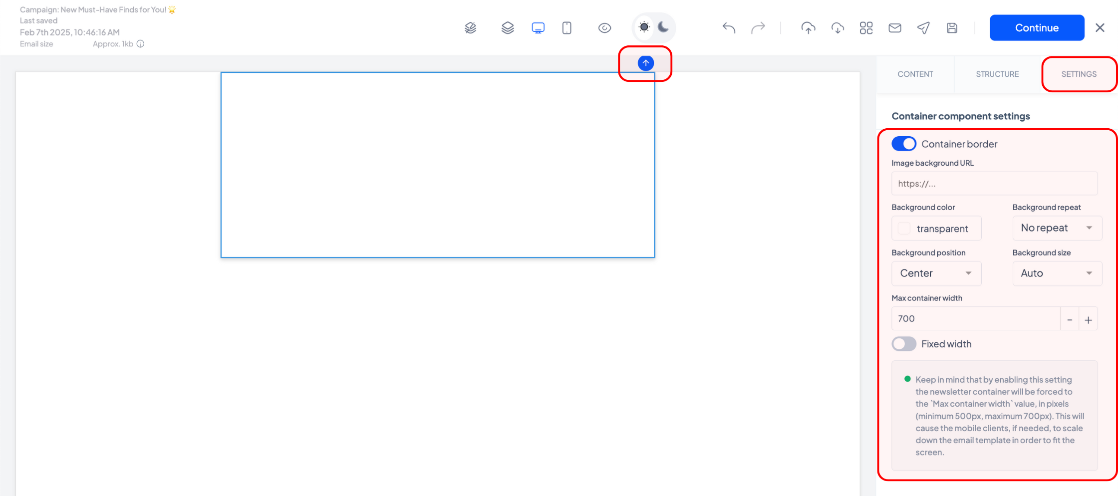
1. The email ‘canvas’ or ‘parent’
The email canvas is the base of your email, the outermost container that holds all elements.
To identify the parent container, click the ‘Select parent’ icon multiple times until nothing else changes on your screen or in the ‘Settings’ tab. When starting from scratch, this appears as a blank rectangle that cannot be deleted.
When the ‘parent’ is selected, you will notice several options on the right-hand side, under the ‘Settings’ tab. You can enable its border using the ‘Container border’ toggle, set a background image or color, and adjust the maximum width of the email (as long as it’s between 500 and 700 pixels).
You can also set a fixed width using the ‘Fixed width’ toggle. However, if you enable it, your email content will no longer be adaptive, but it will be scaled down on mobile devices, which may affect the user experience.
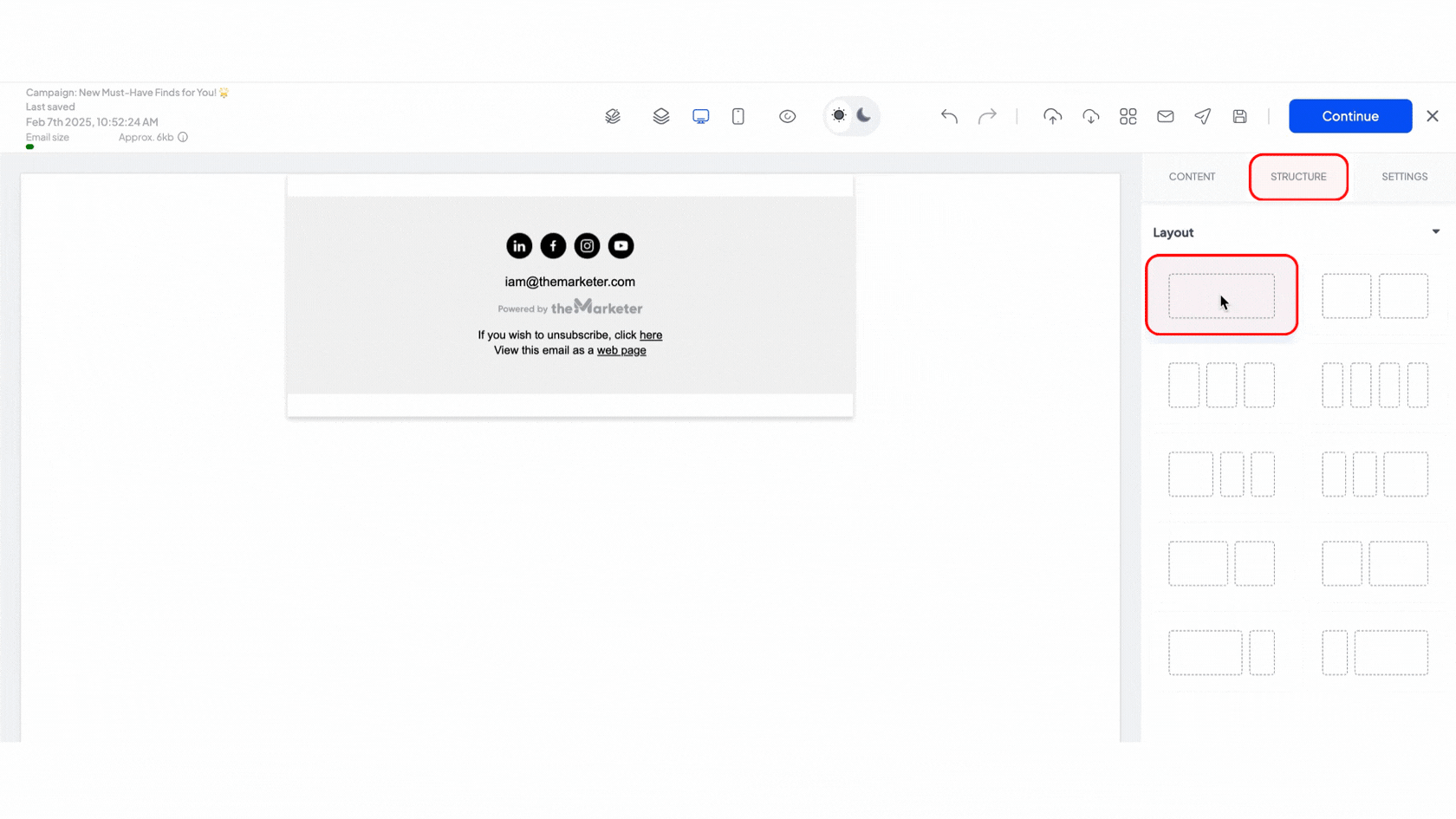
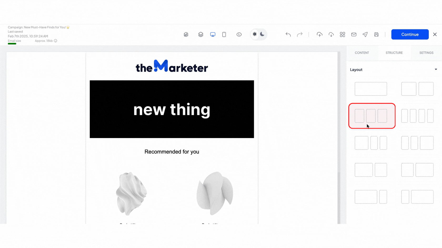
2. The layout components
Layout components are the invisible structure of your email—the ‘shelves’ that organize your content blocks.
Under the ‘Structure’ tab, you’ll find ten layout options. You can add any of these to your email ‘canvas’ and you can also stack them within each other for complex designs.
For example, if you generated a coupon offering 10% off with the code ‘TEST10’, enter ‘TEST10’ in the ‘Discount coupon’ field and ‘10%’ in the ‘Discount value’ field. If your discount is a fixed amount (e.g., 10 euro) or offers free shipping, type ‘10 euro’ or ‘free shipping’ in the ‘Discount value’ field instead.
Keep in mind that all email elements should be placed within at least one layout container to display correctly across different devices.
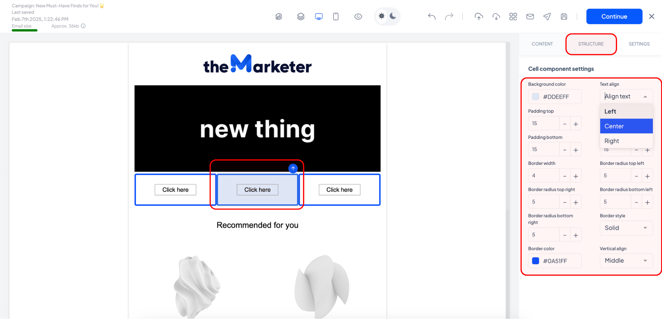
Each layout cell acts like a mini canvas, giving you full control over their individual content, including their background, content alignment, padding, and border style.
Why use layout components?
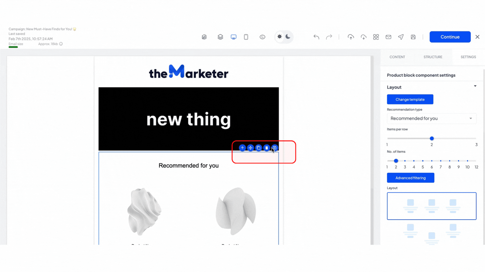
There are many benefits to using layout containers in your emails. They help you better control the deign of various sections of your email and also move, duplicate, delete, and save several content blocks at once instead of performing the actions on each individual block.
For example, you can add all the elements you’d like to save to a layout container, edit them, then press the ‘Select parent’ icon until your container is selected. Then use the in-line options to save the entire section, so you can then re-use it in other future emails.
Optimizing for mobile with stacking
When adding layout components that feature multiple cells on the same row, you can further optimize your design compatibility across mobile and desktop devices by enabling stacking. This means that when your email is viewed on a desktop, the cells will be horizontal, but on mobile, the content will be split cell by cell and displayed vertically.
To do this, select the layout container, then enable the ‘Stack cells on mobile’ toggle under the ‘Settings’ tab and choose the order in which the cells will appear by clicking one of the two options.
And that’s all. When you understand email layout and structure, you can create well-organized, visually appealing emails that look great on both desktop and mobile.
Happy emailing!
Related articles
STILL HAVE QUESTIONS?